
This is for any (anxious) Modern Memoirs client I ever worked with… I feel for you! This retrospective describes my own experience of single-handedly creating an art book (alas, without any team behind me)—the myriad details that bombarded me, the endless worries I tried to combat. Don’t try this alone! Of course, the outcome was well worth it for me.
—Ali de G.

Untitled 12 © Michele Théberge 2025
It starts out light, a whim, a phone call between you and a friend. She’s a painter; you’re an occasional writer. She asks, “What are you working on lately?”
“Not much, you?”
She texts you an image of her artwork. After you hang up, you sit down and stare at the painting on the screen and feel compelled to write down the words that fly from your pen. (Or your keyboard.) You text this reflection back to your friend, adding, “Send me another painting!”
About every month, she sends an image, and you find some time to write down a reflection. You might be sitting at home in your kitchen, or outside in the grass, in a doctor’s office, or in a camper on a long drive south to New Orleans. It’s inspiring, sharing art in the ether, especially with a dear friend, especially since you live on opposite sides of the country. Two different worlds and minds come together, like zaps of lightning, spanning distance, connecting souls.
The fun goes on for some time, and when you see that you have a collection of a dozen paintings and a dozen little scribblings, you say, “Hey, we could make a book out of this!”
“Fun! Let’s do it,” she says.
And at that very point, Fun seems to run for the hills.
Now it is Work. And it isn’t easy! But you know how to do this.
Book Design begs a thousand and one questions. What size for the book to best fit the content? How to balance the pages? Do the words and the art complement each other? Which fonts reflect the tone? What size font, how much leading between lines? Where to place the words in relation to the images? Centered or flush left, flush right? What colors to use, or will they compete with the paintings? Margin width? Running heads, or no? Page numbers absolutely necessary?
The decision whether to include titles for the poems or not can take a full month. Then there are font nuances: uppercase, lowercase, italics, semibold, display, condensed, semibold-condensed? Then the titles of the paintings. Where to place? Same font, different font? Table of contents—required? List of paintings at front or back? Can the list fit on one page? On and on the questions come; just as you finish one layout idea, another option arises.
Finally, you’re more than a little sick of thinking about all this, realizing that you just need to get the book done. It’s been months… (perhaps years, with the COVID time warp).
Now to Proofread… you’ve looked at the words a hundred times and don’t want to look again. You know you should have another set of eyes proof it, but you don’t want to share it with anyone else at this point because it might undo everything you’ve done. It’s like a secret that you must hold tightly in order to finish the thing, before letting it go. And, like Oscar Wilde, you spend a morning putting in a comma and an afternoon taking it out.
Every time you re-read it, one or another poem sounds boring. Sometimes they sound shallow, sometimes they sound dark, too dark. On one page, you decide to change the word “carrion” to “prey.” WHY? Why not just leave it? That’s what came out when you wrote it, and now you’re just taking it upon yourself, godlike, to reinvent the moment? (But how will the reader see it? Is it too heavy? Too this? Too that?) It’s agonizing. Stop!
Don’t read anymore! If you read it again, you know a letter or a word will jump out, yelling, “Change ME! Change ME!” Don’t listen, even though you have to open the file over and over to check a painting title, check the page specs, check the copyright page—don’t read! And don’t think about the ghostly reader.
Why didn’t you just make a simple calendar with the art? There are 12 paintings after all. That would be so much easier. Who cares about the words? Why? Why not? What if? So what? But you know you have to keep going.
Time for Cover Design. Fortunately your artist friend has already thought up a title for the book. The Deep Dark Light. Agreed! That was easy. But then there’s the subtitle. “Poems and Paintings” sounds nice, alliterative, but how about “Paintings and Poems”? Well, if we alphabetize the author’s and artist’s last names, “D” comes before “T” so the poems would come first, then paintings. Good. Decided. But as time plods on, it’s the word “Poems” that seems absolutely wrong. Pretentious! These aren’t poems! What are they? More like meditations? Nah. Musings? No. Prose? No. Reflections? Argh! There are no words to describe your own words. You break your own rule, dare to ask someone else, an outsider, what they think. All hell might break loose now. “Poems” they say. OK, done! (You should know that you will continue to struggle with the word “poems” long after the book is printed.)
OK, well, almost done. Preparing for print, you need to have CMYK images for the printed book, and RGB images for the digital book. Now that you’re feeling almost ready to roll, the artist must re-evaluate all the images to feel reassured that they will be reproduced on paper as the originals appear. Dozens and dozens of jpegs (and weeks, months?) go back and forth before the images settle in their places. And go figure—one never actually knows how they’ll look until the proofs are printed.
On to Production! What kind of paper? Gloss, satin, matte, natural, opaque? What is the weight and the opacity of the paper? The ppi? (Pages Per Inch.) What kind of printing process? Digital? Offset? What kind of binding? Sewn, saddlestitched, or glued? Cover paper? Gloss or matte lamination? Satin lamination?
You get the files to the printer after meticulously fitting them to exacting specifications (re-fitting numerous times). Now you can sit back, relax for a while, maybe? It’s out of your hands. More years pass, though it might be just weeks. Then the proof pages are printed. It’s so exciting to hold the soft, smooth pages, printed in color on professional paper. It’s almost a book. (Don’t read it!)
Proofs approved, you must sit back again and wait, wait, wait.
The original reasoning for having a book eludes you. Who really cares? Why did you do this? And it’s so much more expensive than you thought… but you know you have to keep going.
Don’t ask the printer the status, don’t rush them; mistakes happen when you rush. You told the printer it’s just a personal project with no deadline. Now you regret saying that but resolve not to call them. Just when you’ve blocked it from your mind, you receive a call. Has it been weeks? Months? It’s ready for pickup at the printer.
You don’t go right away. You go the next day, or even the next. You don’t want to go alone but you do. Amazingly, Fun shows up. You receive the box, open the box, see the shiny book cover gleaming at you. It’s smiling! Now THIS is why you did the project!
Soon enough you can start to wonder (worry) about your readers’ impressions when you hand out the books. But that will wait for another time….
Try to enjoy one moment, now, just for now. It is worth it.
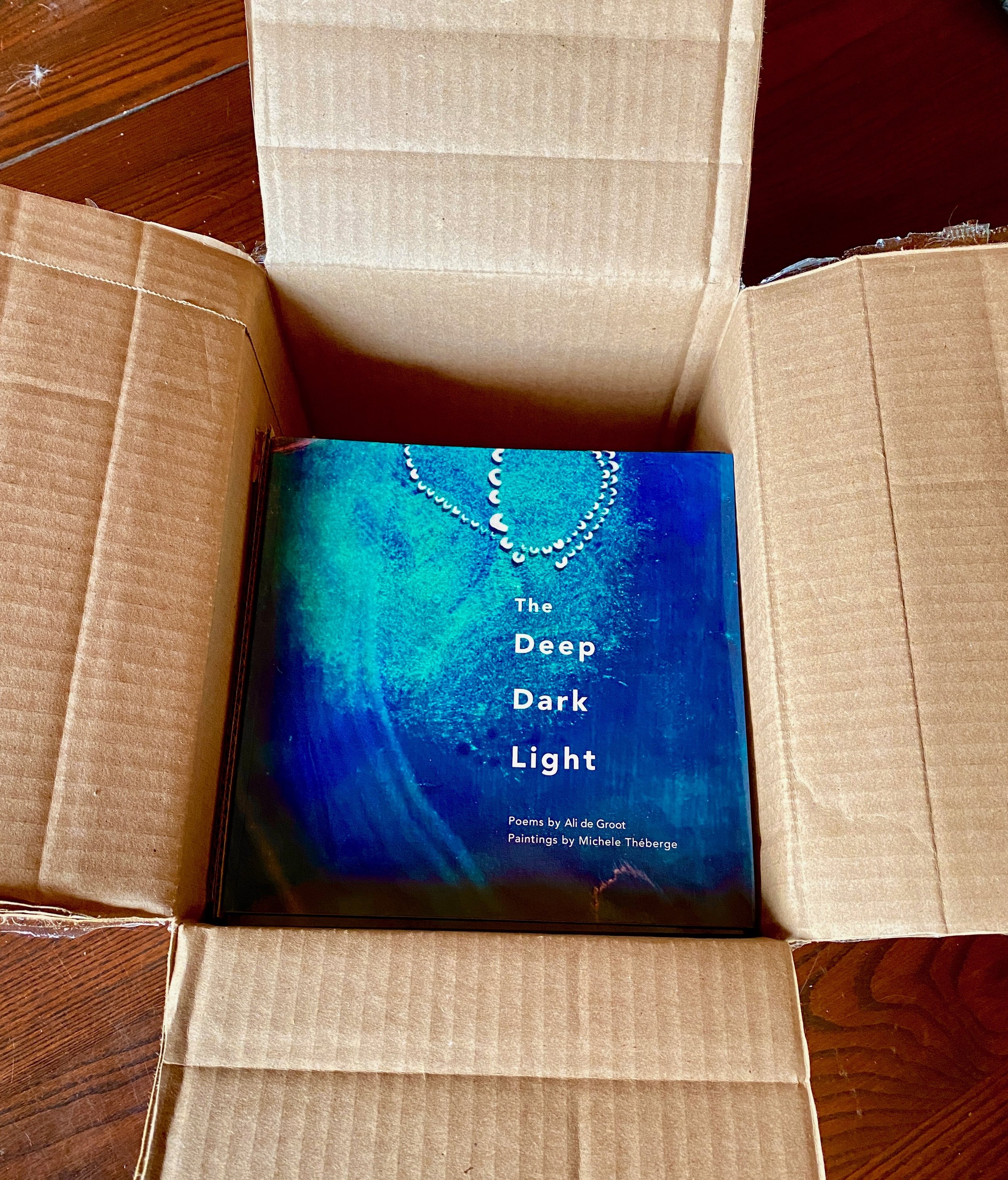
The box of books, fresh from the printer
If you’re interested, visit our Online Author Page, where you can learn about the two authors and also view the Digital Book version of The Deep Dark Light: Poems by Ali de Groot; Paintings by Michele Théberge.